ZYNGA LEADERSHIP: CHANGE MANAGEMENT
INTRODUCING A PRE-PRODUCTION Approach to A Traditional Game development Pipeline
Project
Zynga Studio Change Management
Role
Management, Interaction Design and UX Research
Team
Lead UX Designer (2) and Senior Designers (2)
Date
September 2016-October 2018
problem
Zynga’s Puzzle creative team melded richly painted art, original composed music, and spirited animation into some of the company’s most gorgeous games. When given full game design requirements and a defined template to follow, the team executed quickly utilizing a waterfall method of deliverable phases.
However, this method did not work well with large complex UX features that required a more iterative process and working with cross disciplines. Discipline teams from creative, product, and engineering were not entirely aligned on the creative vision. Product team often defined the business and creative requirements in their spec document, leaving no room for interpretation for creative team. Once the art and animation is created, it became much harder to make change.
GOALS
Ensure the game delivered a great player experience for players and the team was well-equipped to build metagame features on time
Improve the pipeline by introducing a pre-production phase and convince relevant stakeholders of the value of getting alignment before production starts.
Establish UX principles that are agreed upon by cross-functional partners
PROCESS
In my first few weeks, I interviewed several stakeholders, game leads, and my direct team. What are the strengths and weaknesses? What is the creative vision for casual puzzle games? What are the known issues and what are the unknowns?
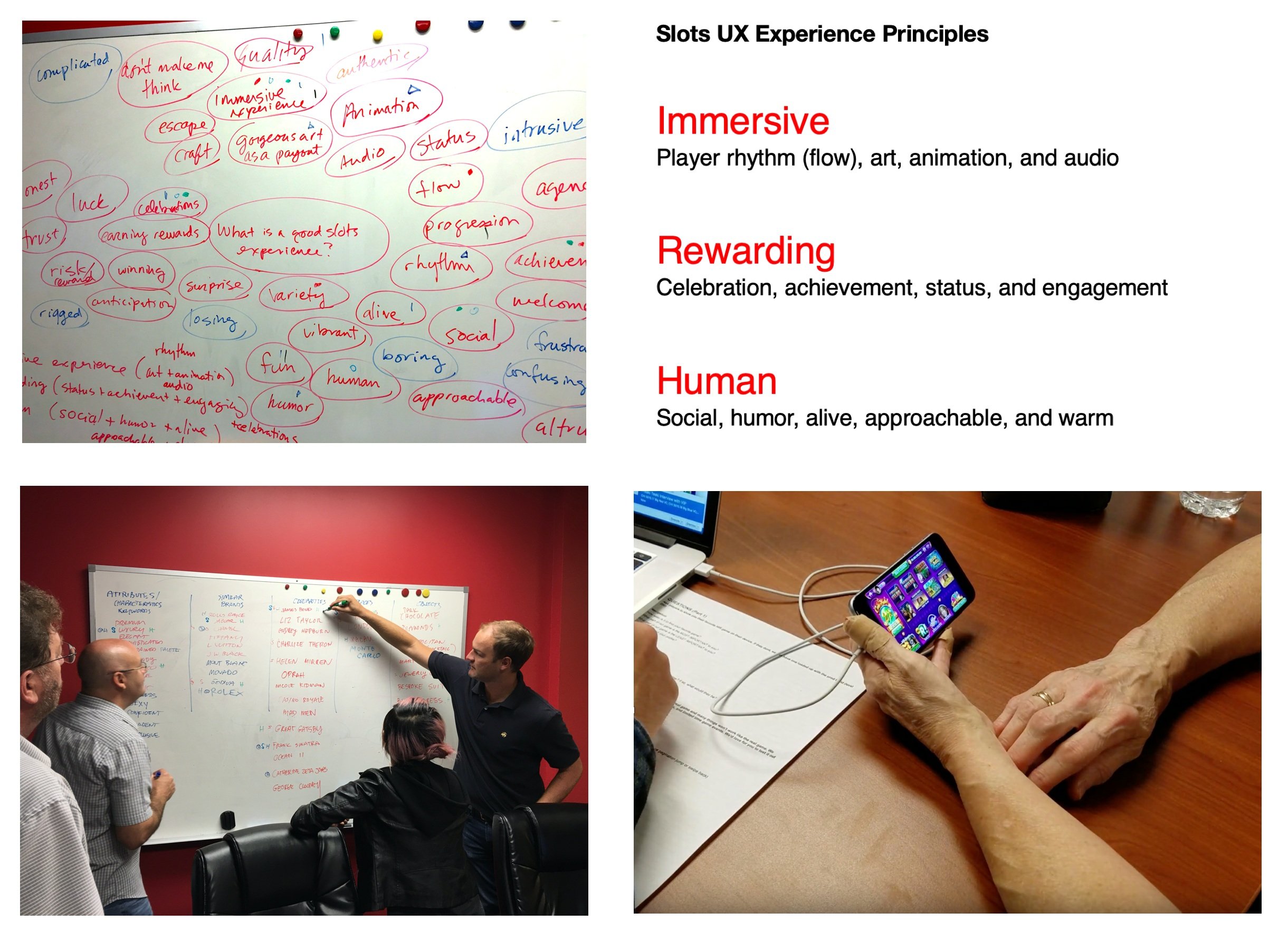
I organized a team workshop that lasted two days. I utilized mind maps so we could begin to align goals and commonalities between all stakeholders. One mind map was to jot down “What makes a good casino experience?” and the other “How can we communicate better? We discussed creative process and core design principles that everyone could align on.
Pipeline Optimized for Efficiency
Based loosely on Google design sprints, I worked out a pre-production process which the UX team could complete in less than three weeks. The UX team worked closely with product and engineers to define what can be built that satisfies both business and design goals. One of the key deliverables to the rest of the team was a clear path forward with high level wireframes and user stories. The new process allowed the the entire production team to collaborate and be more invested from start to end. Since the required assets and tasks were more clearly defined, costing and scope was more accurate, and from there, the team was able to prioritize and focus on important tasks. The next two to three weeks remained for the UX team to focus on prototype refinement and quick testing with the internal team first, then actual players.
SOLUTION


Among the four designers including myself, we used Illustrator, Photoshop, Sketch, Adobe XD, and Axure. For complex interactions with multiple states and edge cases, the UX team went one step further by creating an interactive prototype. It was critical to be able to put our designs on an actual device and test with real players. After weighing options and conducting research on what works the best for a multi-platform game, we chose Axure as the primary tool for wireframing and prototyping. One of the senior UX designers and I worked on developing a UI toolkit within Axure in order to lessen the learning curve for other designers while standardizing the look. We identified the most commonly used design patterns in our game: carousel navigation, horizontal and vertical scrolling, pagination, and side drawer. For each, we developed Axure widgets that the design team could then drop and customize for their own feature prototypes.
By building a good design system and widgets, we were able to reduce the learning curve, increase feature parity, and improve our pre-production time.
RAPID PROTOTYPING

Styleguide
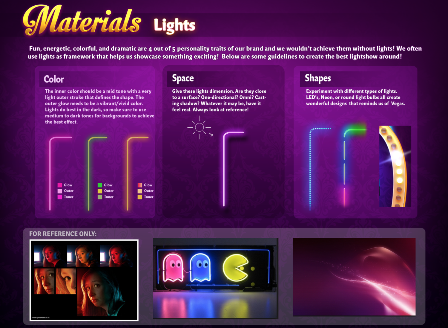
Along with the Art Director, we established a style guide to refresh the UI style of the game. The art director wanted a festive ‘Carnivale’ meets ‘Old Vegas’ feel with organic forms polished with rich gold and illuminated with neon lights. To achieve this goal, I had to break down which UI elements could be unique one-offs and which could be standardized. The goal was to strike a balance between the two so that the game was always a feast for the eyes but also lightweight on the app size.
Cross-discipline alignment
With pre-production design sprints, the team was more invested and better understood the scope. Bringing cross-discipline partners early in the concept phase resulted in more accurate costing and better build quality.
Playtesting Reduced the Bug Count by 30%
Prototype testing validated our design assumptions at earlier stages before production. Testing new features in soft launch and making iterations late in the process wreaked havoc for everyone. Prototyping solved this so the team could identify UX issues and still resolve them before launch.
Reduced Design Debt
With the redesign and revamped UI toolkit, UI art production time was shaved, giving us more time to work on the UX flows. The UX team imported the UI elements into Unity so that engineers could also easily create quick dialogs, instead of waiting for the final art. A pleasant benefit of the new UI style is the smaller app size after optimizing all the sprite sheets and cleaning up unused dialogs. Overall, it took one year to complete but we eliminated 90% of the art/design debt that was in the game.
Improved Design Roadmap Planning
With the new pipeline and UI toolkit, we were prepared to revamp the style of the game. Working with producers, we first worked on the features that had 80% engagement and gradually planned to do redesign sprints to completely reskin the entire game. Each sprint would be scheduled every quarter, and I would work with producers, engineers, and product managers on planning, costing, and necessary resources.